

Poppyseed Bakery
Brand Identity and Packaging Design
The Challenge
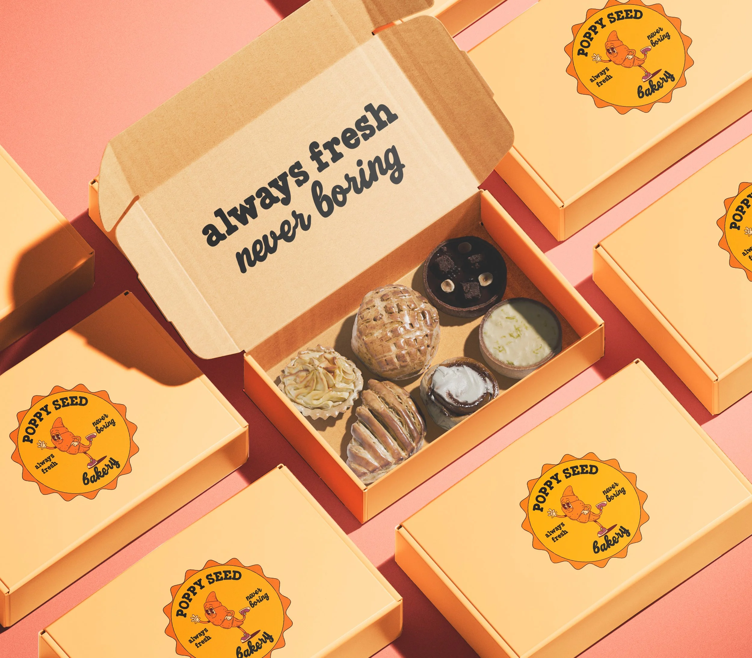
Poppyseed Bakery came in with almost nothing. A name, a concept, and a product worth being proud of. But the brand was not showing up that way. There was no visual personality, no warmth, no packaging direction that made someone want to pick it up off the shelf. For a bakery, that is a real problem. Food brands live and die by the feeling they create before you ever taste anything.
The goal was to build a brand identity from scratch that felt genuinely joyful and inviting without tipping into generic or childish.
The Approach
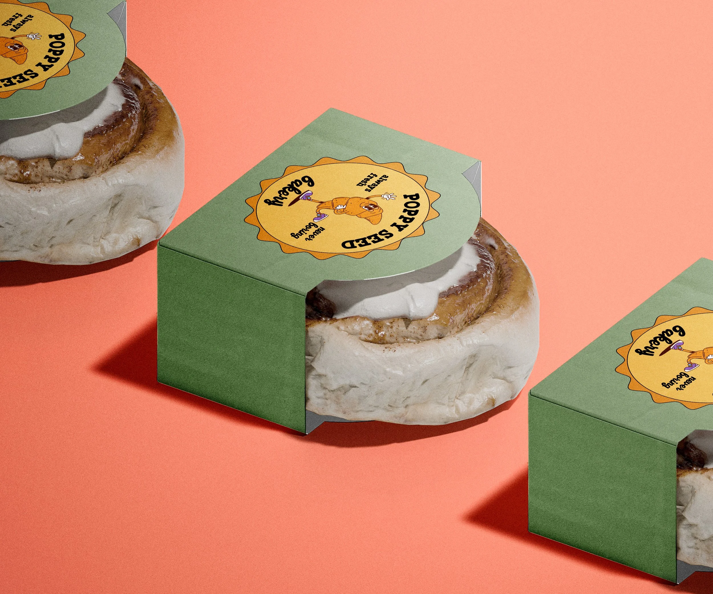
I started with illustration because no template was going to give this brand the personality it needed. Custom characters and patterns became the brand's visual language before a single word of copy was written.
Everything was designed to work as a full system at multiple scales. The sticker on a bag. The print on a box. The pattern on tissue paper. All of it needed to feel like the same world so the brand would be recognizable whether someone saw it in person or on Instagram.
Typography stayed friendly and approachable without being juvenile. Color leaned warm and inviting. Copy was written to feel like the brand had a personality you actually wanted to spend time with.
Deliverables
Custom illustration system
Brand color palette and typography
Pattern design for packaging and collateral
Packaging mockups across multiple formats
Brand voice and copy direction