Soleil Vodka + Soda.
Brand Identity Refresh: From generic to golden hour.
The Challenge
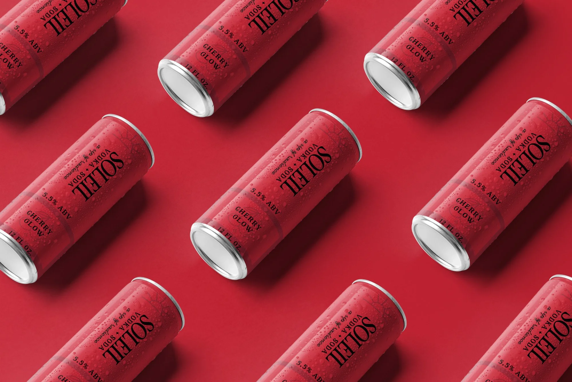
Soleil had a great product. Light, crisp, made for warm weather and the kind of afternoon you want to remember. But the brand was not showing up that way. Inconsistent visuals, weak hierarchy, no clear positioning. The packaging was not doing the product justice and the brand had no voice.
The Approach
The work started with feeling before it started with design. What does Soleil actually make you feel? Sun on your skin. Ease. Effortlessness. Every decision from that point was anchored to that feeling. Typography moved toward editorial contrast with a confident serif paired against a clean modern sans. Color shifted into warm, saturated lifestyle tones. Copy was stripped back to sensory present-tense language that puts you in the moment instead of describing the product from a distance.
The Deliverables
Brand positioning and voice direction, Full visual identity refresh, Typography and color system, Packaging direction and mockups, Campaign copywriting